
Blog
Instagram vs. LinkedIn Carousels: What's Different and Why It Matters
If you're a content creator or social media manager who's tried to repurpose carousel content across Instagram and LinkedIn, you already know the frustration. What works beautifully on one platform falls flat on the other. The dimensions are wrong. The tone feels off. The engagement tanks.
That's because Instagram carousels and LinkedIn carousels aren't just different formats—they're built for fundamentally different audiences, contexts, and behaviors. Understanding these differences isn't just nice to know; it's the difference between content that performs and content that gets scrolled past.
In this guide, we'll break down exactly what separates Instagram and LinkedIn carousels—and more importantly, how to successfully repurpose your content across both platforms without starting from scratch every time.
The Technical Differences: Format and Specs
Let's start with the basics that trip up most creators: the underlying format itself.
Instagram Carousels: Native Image Slides
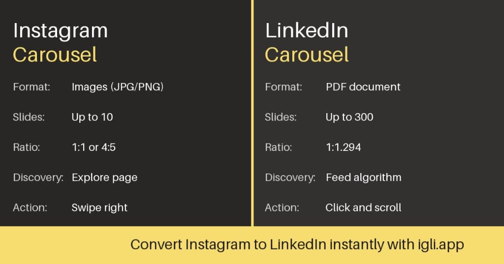
Instagram carousels are built on native image (or video) slides. You upload up to 20 individual images or videos, and users swipe through them horizontally within the Instagram app.
Key specs for Instagram carousels:
- Dimensions: 1080×1080px (square), 1080×1350px (portrait 4:5), or 1080×608px (landscape 1.91:1)
- File formats: JPEG, PNG for images; MP4 for video
- Slide limit: Up to 20 slides per post
- Max file size: 30MB per image
Portrait (4:5) carousels tend to perform best because they take up more screen real estate in the feed, grabbing attention as users scroll.
LinkedIn Carousels: Uploaded Document PDFs
LinkedIn doesn't have a native carousel feature in the same way Instagram does. Instead, LinkedIn "carousels" are actually document posts—you upload a PDF, PowerPoint, or similar file, and LinkedIn renders it as a swipeable document in the feed.
Key specs for LinkedIn document posts:
- Dimensions: 1080×1080px (square) or 1920×1080px (landscape) work best
- File formats: PDF, PPT, PPTX, DOC, DOCX
- Page limit: Up to 300 pages (though 5–15 slides is the sweet spot)
- Max file size: 100MB
This PDF-based format means LinkedIn carousels behave differently than Instagram's. They're essentially slide decks embedded in the feed—which opens up different design possibilities but also different constraints.
Audience and Tone: Two Different Worlds
The format differences are just the beginning. The real distinction is in who you're reaching and what they expect.
Instagram's Audience: Visual Storytelling First
Instagram users are primed for visual content. They're scrolling through lifestyle imagery, aesthetic inspiration, and entertainment. Even educational content on Instagram tends to be delivered with bold visuals, punchy text overlays, and a conversational, sometimes playful tone.
What performs well on Instagram carousels:
- Eye-catching cover slides with bold hooks
- Minimal text per slide (think: 30–50 words max)
- Strong visual hierarchy—graphics, icons, whitespace
- Personal storytelling and relatable content
- Trending audio or meme-style formats (when applicable)
- Hashtag-driven discoverability
The Instagram algorithm rewards saves and shares, which means carousel content that teaches something "save-worthy"—like tips, how-tos, or checklists—tends to outperform purely promotional content.
LinkedIn's Audience: Professional Value and Insight
LinkedIn users are in a different headspace entirely. They're on the platform to learn, network, and advance professionally. Content that performs well tends to be educational, data-driven, or insight-rich—delivered with a more polished, professional tone.
What performs well on LinkedIn carousels:
- Educational frameworks and actionable takeaways
- Industry insights, data, and trends
- Professional credibility and thought leadership
- Clear, readable text (higher density is acceptable)
- Case studies, before/after transformations
- Engagement hooks (questions, CTAs for comments)
LinkedIn's algorithm favors dwell time—how long someone spends viewing your content—so carousels that keep people swiping tend to get more reach. That means each slide should deliver value and create curiosity about what's next.
Design Differences That Actually Matter
Knowing the platform differences is one thing. Applying them to your designs is another. Here's what to focus on when adapting carousel content between Instagram and LinkedIn.
Text Density: Less vs. More
Instagram: Keep it minimal. Large fonts, short sentences, and plenty of whitespace. Users are scrolling fast—you have milliseconds to hook them and seconds to deliver your point.
LinkedIn: You can afford more text per slide. Users on LinkedIn expect to read; they're looking for substance. That said, don't write paragraphs—bullet points, numbered lists, and short blocks of text work best.
The adaptation move: When repurposing an Instagram carousel for LinkedIn, you often need to expand the text. A single Instagram slide with a punchy one-liner might become two LinkedIn slides with more context. Conversely, a text-heavy LinkedIn carousel might need to be stripped down and split across more slides for Instagram.
Branding Conventions: Personal vs. Professional
Instagram: Personal brands tend to outperform company brands. Even when posting as a business, the most successful Instagram carousels feel human—designed with personality, not corporate polish.
LinkedIn: Professional credibility matters more. Your branding can be more polished, and including your name, title, or company logo on each slide is common practice. Thought leadership content often performs best when it's clear who the expertise is coming from.
The adaptation move: Consider adjusting your brand presence when repurposing. A logo-free, personality-driven Instagram carousel might benefit from adding a subtle professional footer on LinkedIn. A corporate LinkedIn deck might need to feel more casual and personal for Instagram.
Call-to-Action Placement
Instagram: CTAs are typically placed in the caption, not on the slides themselves. The last slide might include a soft CTA like "Save this for later" or "Share with a friend who needs this," but explicit sales CTAs on-slide often feel out of place.
LinkedIn: CTAs can be more direct. The final slide of a LinkedIn carousel often includes a clear next step—visit a link, comment below, connect with the author. LinkedIn audiences expect and respond to professional CTAs.
The adaptation move: Rework your final slide when repurposing. What works as a conversation-starter on Instagram might need to become a direct call-to-action on LinkedIn, and vice versa.
Cover Slide Hooks: Scroll-Stopping Strategies
Both platforms require a strong hook on slide one, but the type of hook differs.
Instagram hooks that work:
- Bold, benefit-driven statements ("5 mistakes killing your engagement")
- Relatable pain points ("POV: You just spent an hour on a carousel no one saw")
- Curiosity gaps ("I tested this for 30 days. Here's what happened.")
- Trending formats and memes
LinkedIn hooks that work:
- Data and specificity ("Our team grew 47% in 6 months. Here's the framework.")
- Professional contrarian takes ("Why I stopped [common industry practice]")
- Frameworks and models ("The 4-step process behind [result]")
- Story-driven setups ("Last year, I made a mistake that cost us $50K...")
The adaptation move: Your cover slide almost always needs a rewrite when moving between platforms. The same underlying content can be framed very differently depending on whether you're speaking to Instagram's visual-first audience or LinkedIn's insight-hungry professionals.
Repurposing Carousels: What to Change vs. What Stays the Same
Here's the good news: the core content of a great carousel often works across both platforms. If you've created something genuinely valuable—a useful framework, a step-by-step guide, an insightful breakdown—that value translates.
What Usually Stays the Same
- The core message or teaching: If you've built a carousel around a useful idea, that idea is platform-agnostic.
- The basic structure: A 10-slide breakdown might stay 10 slides (or close to it).
- Key visuals or diagrams: If you've created a helpful graphic, chart, or visual explainer, it can often be reused.
What Usually Needs to Change
- Cover slide hook: Reframe for the platform's audience and tone.
- Text density and font size: Expand for LinkedIn, simplify for Instagram.
- Caption and CTA: Captions are longer and hashtag-driven on Instagram; shorter and more conversational on LinkedIn (where engagement happens in comments).
- Branding and visual style: Adjust the level of polish, personality, and professional credibility signals.
- Dimensions (sometimes): If you designed for Instagram's 4:5 portrait, you may want to adjust for LinkedIn's 1:1 square or 16:9 landscape.
The Manual Repurposing Workflow (The Painful Way)
If you're repurposing manually, here's what the process typically looks like:
- Export your original carousel slides from Canva, Figma, or your design tool
- Create a new project with LinkedIn dimensions
- Re-import or rebuild each slide in the new format
- Adjust text sizing, spacing, and layout for each slide
- Rewrite the cover slide hook
- Update the CTA slide
- Export as PDF
- Upload to LinkedIn
Time required? Anywhere from 20 minutes to an hour, depending on complexity—and that's if nothing breaks along the way.
The Smarter Workflow
The friction of manual repurposing is exactly why so many creators either skip LinkedIn entirely or post the same content without adapting it—neither of which serves your audience or your reach.
The smartest creators are looking for ways to shortcut the reformatting while still making the platform-specific adjustments that matter. They invest their time in the creative work—tweaking hooks, adjusting tone, optimizing for the platform—while automating the tedious format conversion.
Common Repurposing Mistakes to Avoid
Before we wrap up, let's address the pitfalls that trip up even experienced creators:
Mistake #1: Posting identical content without any adaptation. Your Instagram audience and LinkedIn audience are different people in different mindsets. A carousel that crushes on Instagram might fall flat on LinkedIn—not because the content is bad, but because the framing doesn't match the platform context.
Mistake #2: Over-adapting to the point of starting over. On the flip side, some creators spend hours rebuilding every carousel from scratch. This isn't sustainable. The goal is strategic adaptation, not complete reinvention.
Mistake #3: Ignoring the caption. On both platforms, the caption matters—but it matters differently. Instagram captions drive hashtag discovery and encourage saves. LinkedIn captions spark conversation and encourage comments. Don't just copy-paste; adapt your caption strategy too.
Mistake #4: Forgetting about mobile-first design. Both platforms are primarily consumed on mobile. If your text is too small to read on a phone screen, your carousel won't perform—regardless of how good the content is.
Why This Matters for Your Content Strategy
If you're serious about building an audience, you can't afford to ignore either platform.
Instagram is where visual-first creators build engaged communities, drive brand awareness, and connect on a personal level.
LinkedIn is where professional credibility compounds—where thought leadership turns into leads, job offers, and business opportunities.
Carousels are one of the highest-performing formats on both platforms. But treating them as identical is a mistake. The creators and brands winning on both platforms understand the nuances—and they've built workflows that let them adapt efficiently rather than rebuild from scratch.
The Bottom Line
Instagram and LinkedIn carousels share a name and a swipeable format, but that's where the similarities end. Understanding the platform differences—technical specs, audience expectations, design conventions, and tone—is essential for anyone trying to build reach on both.
The good news? Once you've created great content on one platform, you don't have to start over for the other. You just need to adapt strategically: reframe the hook, adjust the text density, update the CTA, and make sure the format fits.
igli.app is built exactly for this: drag your Instagram carousel in, get a LinkedIn-ready version out in 30 seconds. Try it free →